Sunday 31 October 2010

Photoshop tutorial: Forest

So during the Photoshop session on Friday I chose to look more at the thumbnail I made of the will-o'-the-wisp darting throughout the forest during the night. The idea for this piece was to have it dark using deep shades of blue. The source of light in the painting would be emitting from the will-o'-the-wisp and would reflect on the nearby trees:


Other than adding some texture to the trees I think I have a better understanding of light which was not so apparent in the previous piece for Unit 1. However I did think that again the colour palette was too limited and painting is very much monotone. So below are some examples of what I have done whilst experimenting with the colour of the will-o'-the-wisp. As a quick note I have also made so adjustments to the background:


Saturday 30 October 2010

Extract 1 Thumbnails: Part 1

Here are some of the thumbnail drawings I've done so far from the first extract:


Thursday 28 October 2010

Influence map 1: Woodlands

Having read the first few pages of my first extract it appears that a woodland setting is the dominant space here, so in order to explore this I have created an influence map looking at forests and typical things you'd find in them i.e.. bushes, roots and trees.

Wednesday 27 October 2010

Film Review: Metropolis

The second film we watched from the ‘World Apart’ film programme was Fritz Lang’s Metropolis which was released in 1927.


Metropolis, a classic german expressionist film and a grandfather of the science fiction genre. Now I personally am a bit skeptical of silent films like this but I found myself really rather enjoying it despite that. 


Metropolis is a depiction of two worlds, both different but exactly the same in many aspects. One 'world' consists of the well off upper class and their luxurious utopian city, whereas the other consists of poorer people in a rundown, filthy city deep below utopia which is almost depicted as a manual labour camp. Peter Bradshaw wrote in his review for the Guardian;


"...there is a perennial frisson in the way the workers' leader Maria longs for a messianic figure who can find a middle way between the head and the heart, the bosses and the workers: he will be the Mediator..."


This is almost a biblical story of a man uniting two 'worlds' that cannot come together on their own. Freder (Gustav Froehlich), the hero, is almost portrayed as the 'Jesus' of the 'Gods' in utopia, sent to save the workers and bring them and the upper class together as one. As Brigitte Helm 'said' in the film bringing hand (the workers) and head (the upper class thinkers) together. Picking up on this point, Ben Walters writing for Time Out London says;


"Building on earlier science fiction and endlessly influential on later works, Lang’s film is a mammoth marvel, fusing modernism and expressionism, art deco and Biblical spectacle, Wagnerian bombast, sentimental Marxism and religiose millenarianism."


What makes this film a real classic isn't so much the story but the settings and environments that are used within it. It is clear they have been carefully thought out and beautifully designed and it makes a great impact on a first time viewer such as myself. In his review for The Independent, Anthony Quinn states; 


"But it's the stupendous design of the film that remains its true glory, whether in the labyrinthine intricacy of the workers' habitat, the monstrous scale of the sets, or the sleek robotic replicant of Brigitte Helm, the heroine's evil twin. Here is the starting-point of so much modern cinema."


Without this film and its carefully thought out settings and designs, I doubt very much that films like Star Wars would ever have existed as Metropolis has made a huge influence in the world of cinema. It is clear that the robotic replica of Brigitte Helm began a trend of humanoid robots used all throughout cinema most notably with that of  C3-PO from Star Wars. The designs are very similar are one can easily make the connection between the two. As for the sets, the size and designs had never before been used and therefore make an even bigger impact on the audience. The scale of the sets combined with the expressionist design provides an element of realism and although this may not have been intended by Lang, it actually detracts from the fact that they are sets and feels like the film is created in an actual utopian city. 


The use of a Mayan sacrificial reference is also a brilliant set idea which helps set the mood of the workers lives, making them appear like sacrifices for the 'gods' above in utopia. In that instance it adds a real depth and tragedy to the rest of the film and is almost a direct representation of slavery and concentrated labour which had stopped only 50 or so years before hand.
  

Life Drawing: Week 6

This weeks life drawing was focused on looking at negative spaces.

Figure 1
The first drawing of the night and we were starting to look at negative spaces. In figure 1 we weren't to give the model any detail but instead draw the objects around her so that they built up the shape of the body.

Figure 2
The second drawing was focused on the same idea as the last however we could add minor details to the body.

All in all I thought this was quite an interesting session because it's a style of drawing I've never approached before now. Although I still need to work at style more it is something I will start employing throughout my coming work.

Film Review: The Cabinet of Dr. Caligari

The first film from the ‘Worlds Apart’ film programme was The Cabinet of Dr. Caligari, a silent film from 1920  which was directed by Robert Weine.


The Cabinet of Dr. Caligari, such a classic silent film and such and influential one at that as the review from Film4 mentions;


"Pre-dating even early genre landmarks Nosferatu (1922) and Metropolis (1926) by some distance, Robert Wiene's silent film is both influential and one of a kind." 


Most modern day minds see silent films and think 'boring' because of the lack of sound (what would they expect its a *Silent* film, duh) and colour and they can't be blamed as they're constantly influenced by colour and sound in films. But films like this aren't about sound and colour, more what's in them. Take for example the character of Cesare. Most likely if he weren't in the film characters like the 'Thin Man' from Metropolis, whose appearances are similar, would not exist either. So yes this film has been particularly influential and contributed to the films that followed.


The style of the sets are both wonderful and weird which makes for an entertaining and awe inspiring film. Nick Hilditch writing for the BBC says;


"Robert Wiene's sinister 1920 feature "The Cabinet of Dr Caligari" is both visually unique and haunting in its use of the infant medium."


The fact that the film is German Expressionist adds to the wonderfully sinister and creative set designs for the film and it is easy to oversee the crude child-like painting when collective they make a sharp and sinister-ish world to match the genre of the film. But all in all the overall 2D-ness of the set makes the film appear more of a theatrical performance; something that looks better suited for a stage than a lens, flat with little in at all any depth.


And then there is the genre of the film. The Cabinet of Dr. Caligari is a founder of the horror genre and although not full of blood, decapitations and mutilation like we're used to (thank you Saw and others) it makes up for it with its stalk and slash methods. Time Out Film Guide makes reference to the fact that it is;


"Undoubtedly one of the most exciting and inspired horror movies ever made."


The suspense, lack of sound and stalk'n'slash methods all contribute to a fantastic horror that keeps you compelled to watch more. Overall this film was the 'Avatar' of its day and shall remain that way so long as it's remembered.


Tuesday 26 October 2010

Research: The NeverEnding Story

The NeverEnding Story is a fantasy novel written by Michael Ende which was first published in 1979 in Germany and four years following it's first publication, in 1983, an english translation of the novel by Ralph Manheim was published.


As a brief summary, the novel is set in a parallel world called Fantastica which is slowly becoming a victim of the Nothing. In Fantastica, the Nothing is a representation of the lack of imagination in the real world. The story follows two protagonists: the first is a young warrior by the name of Atreyu who sets off to find a way to stop the Nothing to save his land. The second is another young boy called Bastian, a boy from the real world who finds himself becoming a part of a book by the same name as the film.  

Since the english publication of The NeverEnding Story, multiple film adaptions have been made. 

The first, The NeverEnding Story, was made in 1984 and was directed by Wolfgang Petersen. It covers only the first half of the novel, up until the point when Bastian himself arrives in Fantastica (Fantasia in the films) after reading the book. However the film has been considered to have been made untrue to the original novel with many aspects changed.


The second, The NeverEnding Story II: The Next Chapter, was made in 1990 and was directed by George T. Miller. This film, although directed by someone else, is a 'continuation' from the first, covering the second half of the novel. However, the plot of the film does not mirror the novel entirely and explores a slightly different story.


The third film produced, The NeverEnding Story III, was made in 1994 and was directed by Peter Macdonald. The film uses the same characters as in the original novel by Ende, however it follows a completely new plot line.


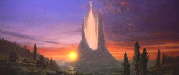
Having watched the trailers to the films it is clear that many of the environments incorporated in them look very much like a typical fantasy world with areas made almost entirely of crystals, looming mountains, murky swamps and enchanted forests. It's almost like the ideas have been drawn out a child's mind looking at the fantasy of what a world of magical creatures and places would appear as to them. 


I think it will be ideal to explore a variety of places that actually look similar to the places shown and described in both the novel and the film adaptions that actually exist.

Monday 25 October 2010

Unit 2: Space

Again the mysterious blue box has delivered my fated folder for this next unit and the wonderful book inside it is... The Neverending Story by Michael Ende.


I've never read or for that matter heard of this book until now, but I look forward to reading it and what kind of spaces my mind will create from its words.

Maya tutorial: Bottle render

At last the final part to the unit 1 Maya projects has been finished:

Maya tutorial: Detective's desk

And here is the detective's desk from our last Maya session. I didn't find this one too difficult and the outcome looks pretty good to me.


Detective's desk: final render

Thursday 21 October 2010

Hybridisation complete: Final piece

At last, it's alive... well at least I am with a lot of new features added to my body. The final piece is now complete, after many hours spent researching, drawing, designing and hybridising, it is finally finished. And here it is, along with a record of progression of how it all came to be:

Stage 1: Base drawing in photoshop
Stage 2: outline the skeleton 
Stage 3: Map exterior outline on skeleton
Stage 4: Add detail to exterior outline
Stage 5: Add fur with fur brush tool
Stage 6: Add the skin under the fur
Stage 7: Add the tusks, hooves and claws
Stage 8: Add the additional teeth to the jaw
Stage 9: Add the tongue and mouth detail
Stage 10: Add the eye
Stage 11: Add colour to the fur
Stage 12: Add colour to the tongue and mouth
Stage 13: Add colour to the skin
Stage 14: Add colour to the additional teeth
Stage 15: Add colour to the tusks, hooves and claws
Stage 16: Add background colours and manipulate using filter options

Wednesday 20 October 2010

Maya tutorial: Poker chips

So the first part of week four's maya tutorial and this time we had to make a set of poker chips. I had a couple of problems with this task, mainly to do with the rendering as the chip designs refused (and still do so) to show the renders I made in photoshop when I applied them. Luckily though they did appear in the final render. I also decided to keep the same chips together because I liked the tidier look compared to the interchanged chip piles everyone else has made. Well here it is, the final render for the poker chips and I have to say i am quite pleased with the outcome despite the problems I had.


Poker chips: final render


Life Drawing: Week 5

This weeks life drawing was focused on proportions again. 

Figure 1
We were tasked with doing a single drawing for the entire two and a half hours, making sure we constantly checked the proportions. i found that this week the proportions method came a little easier than it did last week. The two and a half hours also gave me time to look more at the light hitting the body and the details of the face that I tend get discouraged from doing. The only downside I think that this drawing has is that I may have made the body wider than it should be. But overall this is an improvement for me in the proportions department!

Monday 18 October 2010

Beginning of the end

So I have finally decided on the pose and features that I want my hybrid to have. From the original ideas which had too much boar and not enough human in them, I have adjusted certain features to try and balance out my hybrid without compromising the skeletal structure.

The final skeletal structure
I want the pose of my hybrid to be slightly aggressive due to the boars natural temperament to show that side of the animal coming out in the hybrid


Friday 15 October 2010

Photoshop tutorial: Hybrid pose and layering

Since the last photoshop session I hadn't really progressed a great deal. I was still drawing out the skeleton and adding a base outline of the exterior, so in our fourth lesson I decided it was time to crack on (with the encouragement of Phil) with adding fur and colour to my designs. This is what I got up to:

Initial skeletal outline
This was the original skeleton design for this, just using lines and circles to represent the bones and using minimal detail.
Addition of base outline and palette of colours
Then I moved on to add the base outline of the piece, with a few changes to the designs after the previous weeks tutorial. I decided to humanise the lower leg more as the previous design was too much boar not enough human. I took away the extended heel of the foot and extended the nose/snout to cover more of the exposed lower jaw.
Addition of the fur using my own fur paint tool
Here I started using a fur tool that Phil showed me how to make, and I started to apply it to the outline of my hybrid adding shading where needed and including some fur on the arms which is a new feature I wanted in the design.
Adding colour to the fur
As the final part of the session I started to add colour to the fur using a new screen layer and a dark shed of  brown.

Thursday 14 October 2010

Film Review: Splice

The seventh and final film we watched from the ‘Shapeshifters’ film programme was Vincenzo Natali’s ‘Splice’ which was released in 2009. 


This film is completely different from all the others of the programme in that it looks at nothing to do with metamorphosis but instead with the idea of splicing human and animal DNA to create a hybrid with qualities from all the participants, in this case wings, amphibious lungs and a stinger. The film has a resemblance to the "...Cronenbergian exploration of the perils of inter-species gene-splicing..." in almost every aspect, from the grotesque creation of something horrific that shouldn't exist to the inter-special intercourse. This film screams with influence from Cronenberg's films particularly focusing on the way he can incite disgust in the subject that has been created, even though in this case the subject is beautiful. 


Just going back to the inter-special intercourse that is included in this film, it appears that this film is not without it's Freudian references with the ideas of humans having sex with other species and in this case the supposed father having sex with his created daughter. The ideas of a psychologically unstable family is typical of freudian theology, "...Dren regards Clive with the cowering
 hostility of an unwanted animal. But soon enough, Clive is playing 
good cop to Elsa's bad-mother cop,".

Male dominance appears to be an occurring theme throughout this film. The gender changing hybrid creatures introduced at the beginning of the film both become male and kill each other whilst towards the end of the film Dren becomes male and kills all the male characters gathered near it.

"Then there’s the idea of creatures who change sex in nature, as a part of natural progression. Is this to suggest male dominance..."

Also there is the fact that Dren can only make clicking noises as a female but when it becomes male it has the ability to speak english, which furthers the idea that this films suggests males are more dominant and capable than females.


Quote sources
Quote 1 - http://www.timeout.com/film/reviews/88628/splice.html
Quote 2 - http://www.time.com/time/arts/article/0,8599,1994085,00.html
Quote 3 - http://www.brutalashell.com/2010/06/review-splice/